
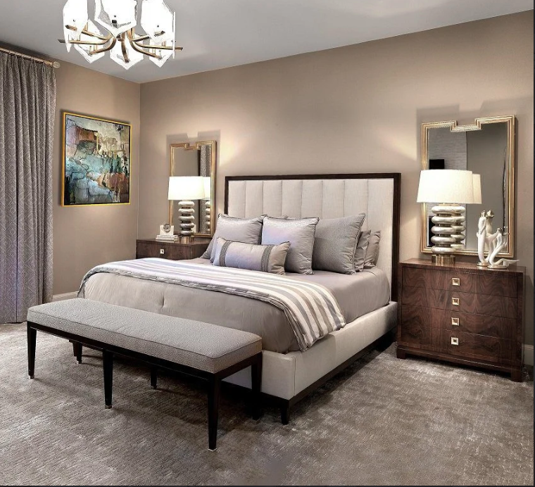
Dark Tones, Lighter Spaces: Rethinking Color in Luxury Interiors!
Summary: Dark colors can work beautifully in minimalist luxury homes when used with balance. Charcoal, deep olive, espresso, and navy can add depth through accent walls, cabinetry, furniture, and architectural details. Jennifer Colby combines color, lighting, texture, custom furnishings, art, and spatial planning to create sophisticated Dallas interiors that feel personal, spacious, and timeless.
A charcoal wall once changed the mood of an entire Dallas living room. Instead of making it feel smaller, the deep shade gave the architecture more depth. That is the quiet power of dark color when used with intention.
Can dark colors work in a minimalist luxury home?
Yes. Dark colors can make a minimalist luxury home feel larger, calmer, and more refined when they are placed with care. Charcoal, deep olive, espresso, navy, and smoky brown can create depth without visual clutter.
As a color consultant Arlington TX, I often remind clients that space is not measured by wall color alone. Light, scale, sightlines, furniture placement, ceiling height, texture, and contrast all shape how spacious a room feels.
The mistake is not using dark colors. The mistake is using too much of them without giving the eye somewhere to rest.
Why can a dark room still feel spacious?
A dark wall can visually recede. That means it may appear farther away than a bright wall, especially when the shade has soft undertones and the lighting is planned well.
Contrast also creates definition. A charcoal wall behind pale stone, warm oak, or softly lit artwork can make those lighter elements appear brighter. The room gains depth rather than losing it.
I think of it much like a beautifully tailored evening jacket. The darker fabric does not hide the shape. It gives the shape definition.
Where should I introduce dark color first?
I usually begin with one architectural or functional element rather than treating the entire room as a single canvas.
A dark accent wall can anchor a seating area. Deep cabinetry can give a kitchen or bar a sculptural quality. An espresso console can ground an otherwise light room. Navy upholstery can add richness without closing the space.
The key is repetition. If charcoal appears on one wall, I may echo it through a lamp, picture frame, chair leg, or piece of art. Small connections make the palette feel deliberate.
Could dark cabinetry make a luxury kitchen feel heavy?
It can, if the cabinetry dominates every sightline. But dark cabinetry paired with lighter stone, reflective hardware, warm lighting, and open visual space can feel exceptionally sophisticated.
I prefer contrast that feels natural rather than dramatic for its own sake. Deep olive cabinetry with creamy stone, for example, can feel warm and collected. Espresso wood can bring richness to a clean-lined kitchen without adding unnecessary decoration.
Luxury is often about knowing what to leave out.
What about dark furniture in a minimalist interior?
This is where proportion becomes essential.
I might use luxurious Brazilian rosewood furniture as a focal point, allowing its grain and craftsmanship to provide visual interest. I do not need ten competing pieces around it. One exceptional piece can carry an entire room.
The same principle applies to seating. A chair covered in a luxurious French textile can introduce pattern, softness, and depth while maintaining a restrained overall palette.
The furniture should have room to breathe.
How does lighting change the effect of dark colors?
Lighting can make or break a dark palette.
Natural light should be studied at different times of day before choosing the final color. Morning light may reveal cool undertones, while evening light can make the same wall appear warmer.
I layer lighting rather than relying on one bright ceiling fixture. Architectural lighting, lamps, sconces, concealed illumination, and accent lighting can create gentle pools of brightness.
That contrast between light and shadow gives a dark interior its atmosphere.
Can dark colors work in a smaller room?
Absolutely, and sometimes they can make a smaller room feel more intentional.
A small room becomes uncomfortable when every surface competes for attention. A carefully chosen dark shade can visually simplify the background and make the room feel more composed.
For living room decorating Frisco, I might use a deep wall color with lighter upholstery, generous spacing, reflective accents, and carefully selected artwork. The result can feel intimate rather than cramped.
The trick is to edit.
What materials keep dark interiors from feeling cold?
Texture is the answer.
Dark color becomes much more inviting when paired with natural wood, stone, linen, wool, silk, aged metal, glass, or richly woven textiles. Each material catches light differently.
I particularly enjoy pairing a dark architectural element with commissioned art, custom floral work, or commissioned art glass. These pieces introduce movement and personality without filling the room with objects.
Minimalism should never mean emptiness. It should mean that every visible element earns its place.
How do I keep a dark minimalist home personal?
I begin with the person, not the palette.
A luxury home should reflect its owner’s taste, routines, collections, memories, and ambitions. A dark color scheme becomes meaningful when it supports those personal details.
That may mean commissioning artwork for a particular wall, designing custom cabinetry around a collection, or creating an ultra-high-end custom piece that cannot be found in another home.
I do not believe in decorating two clients the same way.
What is the biggest mistake homeowners make with dark palettes?
The biggest mistake is choosing color before studying the whole room.
Before I approve a dark paint, cabinet finish, or fabric, I consider natural light, flooring, ceiling height, window direction, adjacent rooms, artwork, furniture scale, and the way people move through the space.
Color does not live alone.
A successful minimalist interior feels effortless because dozens of decisions have been carefully connected behind the scenes.
How I approach dark luxury interiors for Dallas homeowners
My work is about creating distinctive, functional, and timeless interiors with a modern sensibility. I handle everything from a single-room transformation and custom draperies to complete renovations, new builds, bespoke furnishings, and turnkey residential design.
For busy luxury homeowners, that level of coordination matters. I can work with architects, builders, artisans, and contractors while keeping the design vision clear from concept through completion.
My approach is collaborative. I listen first. Then I shape the details around what the client truly wants to live with.
After 30 years in design, I still believe the most memorable homes are not the ones that follow a formula. They are the ones where every finish, fabric, object, and shadow feels unmistakably personal.
Can dark minimalism still feel warm and welcoming?
It can, and that is often where the magic happens.
The right combination of deep color, natural materials, soft textiles, thoughtful lighting, open space, and meaningful art can create a home that feels private, sophisticated, and deeply comfortable.
For me, luxury is not about making a room look expensive. It is about making every detail feel considered.
A dark palette can do exactly that.
Here’s How To Reach Me
A luxury home deserves more than a beautiful color scheme. It deserves a point of view. I am Jennifer Colby, from Colby Interior Designs, and with 30 years of experience, I create personalized interiors that bring your vision to life. Call (310) 722-4558 or email jennifer@colbyinteriors.com to begin the conversation.
FAQs
1. Can dark colors make a luxury home look smaller?
They can when overused. Balanced contrast, natural light, open sightlines, and lighter furnishings help dark tones create depth instead of visual weight.
2. Which dark colors work well in minimalist interiors?
Charcoal, deep olive, espresso, navy, smoky brown, and muted blue-black can work beautifully when matched to lighting, materials, architecture, and furniture.
3. Should every room use the same dark color?
No. A connected palette is usually more elegant. Different dark tones can define rooms while keeping the whole home visually cohesive.
4. Can dark interiors work with modern architecture?
Yes. Dark cabinetry, architectural walls, metal details, stone, and custom furniture can emphasize clean lines while adding warmth and depth.
5. How can a designer prevent a dark room from feeling gloomy?
I balance dark surfaces with layered lighting, reflective materials, natural textures, lighter furnishings, artwork, and carefully planned negative space.